
Turning On the Spotlight
On a grassy hilltop across Lady Bird Lake from downtown sits the Long Center—Austin’s premier performing arts destination. A gorgeous architectural feat with some of the best views of the city, the Long Center is home to Austin’s opera, symphony, ballet, and some of the world’s greatest touring acts.
Perfect location.
Gorgeous building.
Millions of potential customers hungry for great art in the heart of the city.
So why hadn’t the Long Center made enough revenue to cover their costs in four years?
Jamie Grant intended to answer that question. As the new CEO of the Long Center, one of his first thoughts was: Our current website isn’t selling tickets, so let’s solve that problem.
But here’s what often happens: We set out to redesign a website and, before we wield our digital paintbrush, our work reveals other, larger challenges—challenges that need to be addressed now, before a new site is built. Such was the case with the Long Center.
Their ticket sales problem went deeper than the website; they needed a greater understanding of their audiences, a new brand, and a new set of messages. Then they’d get a new website—one that has further cemented the Long Center as a beloved Austin institution.
First Things First
This was the Long Center’s original logo:
Not terrible, just boring. It wasn’t reflective of the Long Center’s vibe or aspirations. After all, Austin has several great performance venues that the Long Center needed to compete with. It enjoyed some benefits— prime location downtown, a beautiful building, some vague brand awareness—but without a bold, clearly communicated, plant-a-stake-in-the-ground brand, it would continue to limp along.
We asked the Long Center—board, staff, volunteers, supporters—to tell us what they thought the “Long Center brand” was. Responses were mixed and often unsure. The Long Center had been so busy building a world-class arts venue that they hadn’t had time to consider their brand deeply.
But we did. We turned to our trusted friend, Research, hoping to discover what barriers stood between the Long Center and its goals. To that end, we would:
- Write, distribute, and analyze a city-wide survey to gather feedback about the existing Long Center brand
- Conduct a dozen small group interviews with a variety of Long Center stakeholders
Combining the qualitative (interviews) with the quantitative (survey) gave us a clear set of marching orders for how the Long Center brand should be crafted, maintained, and evangelized.
What the Research Said
The survey results were unambiguous: Few knew where the Long Center was, exactly, what went on in there, nor where it came from in the first place. Let’s tackle these one by one.

The Long Center was new—new building, new name. Austinites were confused. For decades, that grassy hilltop was home to the Palmer Events Center—a hideous green monstrosity that housed boat shows and whatnot. When the Long Center was erected, the Palmer got a new building next door, but most people thought the Long Center was simply a new Palmer. Confusion abounded. The Long Center didn’t have its own physical identity yet.
Second, people perceived the Long Center as “expensive”—home of fancy symphonies and buttoned-up ballets. In Austin, a city extra proud of its come-as-you-are attitude, “unaffordable, inaccessible luxury” isn’t an ideal brand attribute. That perception had to go.
And finally, most Austinites thought the Long Center must be owned by the city. Not true. The Long Center is a full-fledged nonprofit organization; the $77 million building was funded by 4,600+ individual donors. And therefore, the Long Center continues to need the community’s support. Yet another unfortunate misunderstanding that needed to be addressed.
Other, simpler insights emerged from the research, but these three—Confusing, Expensive, Just Another City Project—would eventually fuel our messaging and design work. We had to use words and images to debunk these myths ASAP.
Messaging Platform
With the research in hand, it was time for the Long Center to put some new stakes in the ground: This is who we are. This is what we believe in. This is why we exist. And here are all the things we have to offer Central Texas.

So together, we crafted a Messaging Platform—a document, usually around 15 pages, that puts into concrete language a brand’s complete story. Organized into bite-sized pieces and meant as an internal-facing document, a typical Messaging Platform includes:
- Positioning Statement
- Why We Exist
- Audience Summary
- Differentiators
- Benefit Statement
- Brand Tone
In close collaboration with the Long Center’s project team, we were able to land on a polished, aspirational, and authentic document that serves as the organization’s communication chaperone, guiding them effortlessly through their growth.
Letting the Logo Lead
Logos are to a brand what cherries are to an ice-cream sundae: an important ingredient, but just one ingredient. Beneath a logo is an entire ecosystem of people, relationships, products, communications, etc. That is your brand, all that stuff underneath. Your logo should just reflect that.
We think the new Long Center logo turned out mighty nice:
How the New Logo Works
1. It Isn’t Boring
In the citywide survey, we asked about the old logo. How did people feel about it? “Boring” and “dull” were the two most popular adjectives offered. Austin’s finest cultural showplace couldn’t ever appear dull. So that became our first mandate: the new logo must feel contemporary, creative, “with it.”
2. It’s a Map
Remember, far too many Austinites had no idea where, exactly, the Long Center was located in the tangle of big buildings in the area. So the logo is almost a picture of the building—e.g., the distinct oval shape (which audiences did recognize), the giant white columns, the river running along the bottom. It’s practically a link to Google Maps.
And now, the Website
By this point, designing the Long Center’s website was a breeze. We’d already been through lots of research, a messaging bootcamp, and logo concepts. The foundation was set. All that was left was to extend the brand digitally.
When you visit any website—any good website, that is—you’re seeing decisions. Every pixel on your website should be placed there for a reason. Every word, every image, every thing should exist intentionally. It’s never enough to explain a design by saying “just ‘cause.”
The website was a hit
Website Metrics at a Glance
With that in mind, here are some successful highlights of the website design:
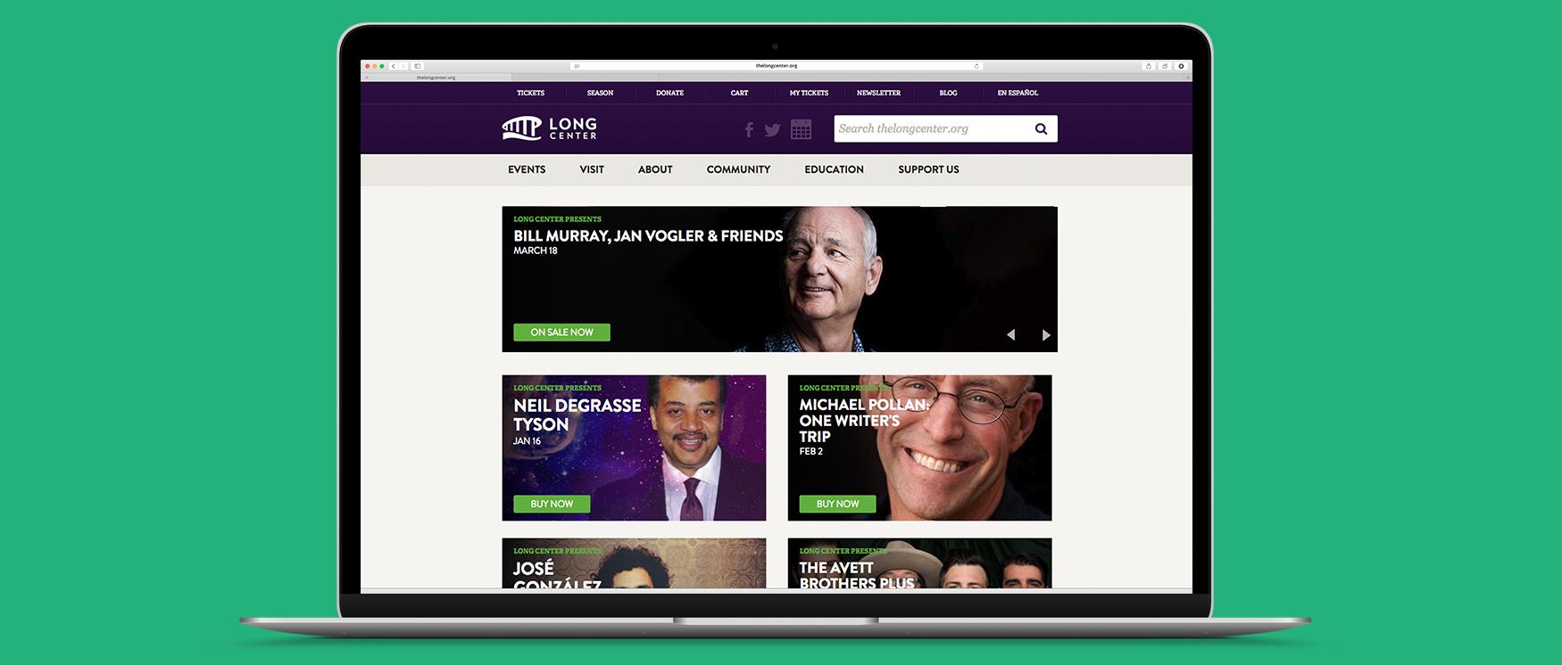
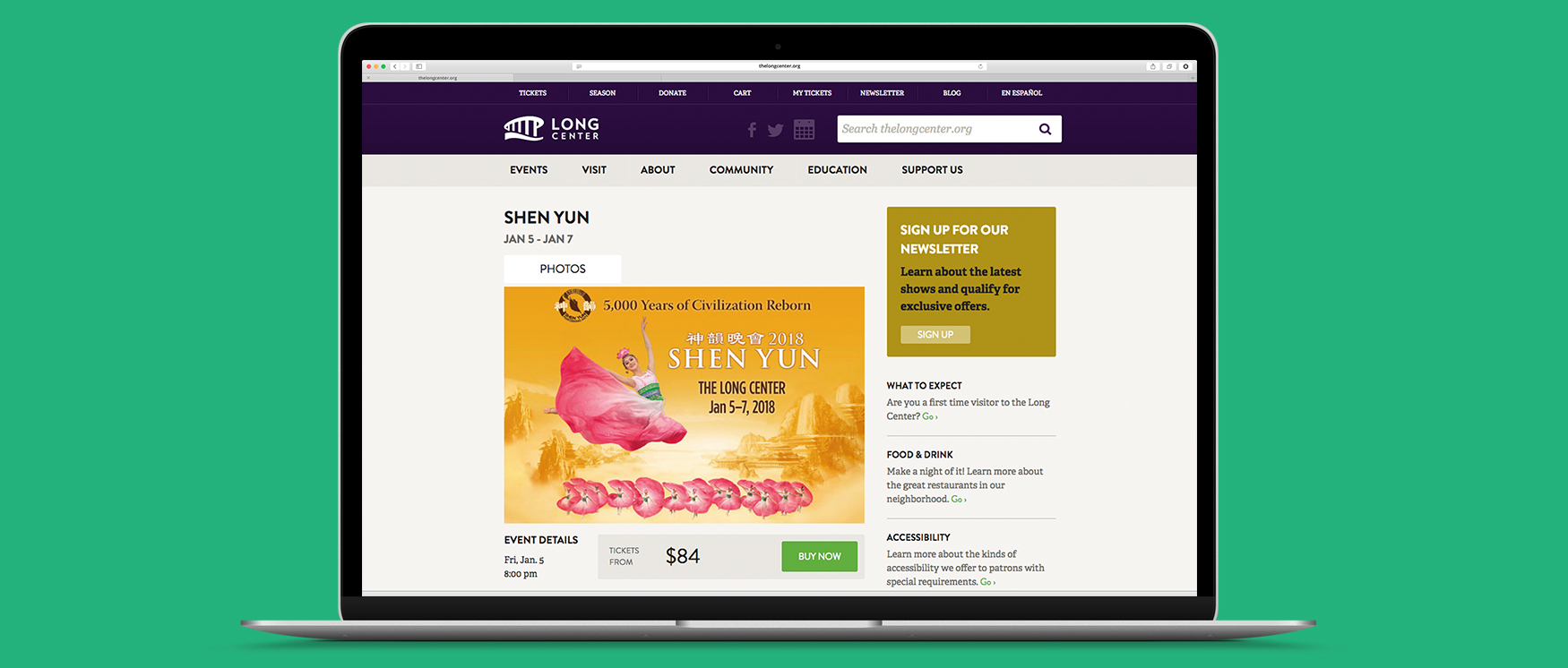
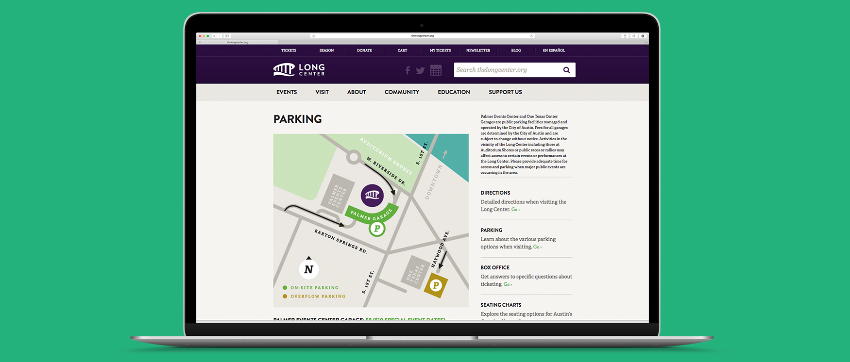
Selling Tickets
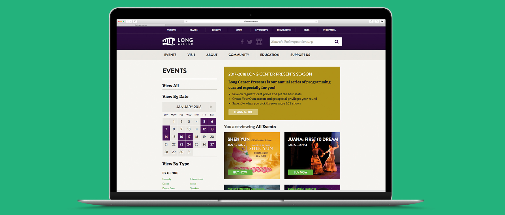
Above all other purposes, the Long Center website should sell tickets. And to sell tickets, you have to know how people prefer to buy tickets. Turns out, people come to the Long Center website to buy tickets in two circumstances:
- They already know which tickets they want, so they’re just there to purchase
- They know they want to see something, but want to browse options
Our information architecture balances those two user needs. From the homepage, Group #1 are one click away from a full event calendar, allowing them to identify their desired show and complete a purchase. For Group #2, the homepage is full of big, bold images of upcoming shows, including date, time, and a “Buy Now” button. Neither of the Long Center’s two primary audiences are left confused or irritated.
(And a bright “SOLD OUT” button appears on appropriate event listings to heighten the urgency. We’re not above using a few classic design tricks!)

En Español
Austin’s Spanish-speaking community is big and growing—accounting for more than 1/3 of all residents. The Long Center is community obsessed. The Long Center was funded by Austinites and works hard to stay relevant to them.
So the entire website is translated into Spanish by actual human beings. Automated translation tools are unreliable and many Spanish speakers have learned not to trust them. One click on the homepage brings users to a hand-translated version of the site, ensuring that the growing Hispanic population of Austin can take advantage of their community performance headquarters.

The Curtain Call
There’s more we could say about our partnership with the Long Center—the style guide, the fundraising campaign, etc.—but every good performer knows when to drop the curtain, to leave the audience wanting more. So we’ll simply end this story by saying:
Reimagining the Long Center’s brand is one of the mightiest delights of our professional career.
Their commitment to community, excellence, and creativity is second to none, and we look forward to countless wonderful performances ahead.