
How to Optimize User Flows on Your Website: The Basics
Do you ever stop by the grocery store to pick up only a carton of eggs? Chances are you leave with more than just the one item.
Unlike most people, I actually enjoy grocery shopping because it’s a great place to learn about—and watch—user behavior in action. You can use some of the methods that grocery stores have used for decades on your website to achieve your business goals.
Effective Web Design Begins with Examining User Flows
A “user flow” is the pathway you want your users to take through your website, ending ultimately in some sort of conversion: “We want them to land on this page, then read this, then click here, then enter their name and email here, then click here…” and so on.
A good user flow is a lot more than just a flashy visual design; even the best graphics can’t help a bad user flow. Without a designed, thoughtful, and curated flow—aka, a funnel—your users will end up confused and frustrated.
Grocery stores have the benefit of knowing that their audience has to eat so they have more room to push their customers in the ways they choose. But in a highly competitive digital marketplace, your competition is just a click away.
Planning and (re)designing an effective user flow will keep your users happy and more likely to follow the path to conversion. If you do this well enough, they’ll keep coming back.
Ensure Your Website Goals Line Up with Your Organizational Goals
What are your business goals? Boosting revenue, membership, donations, etc.?
Once you’ve specified these goals, how are they supported by your website? Getting a lead, a new social follow, a blog subscriber, a trial download, or even a phone call? You need a detailed plan to move your users from arrival on your website to this ultimate goal.
Without a specific goal, it will be impossible to chart out an effective user flow. It becomes an endless maze—or worse, a dull, endless loop.
What Does a User Flow Look Like?
The word “flow” suggests smooth movements—like a calm river or subtle breeze—and we use it to illustrate the experience we want users to have on your website.
A user flow is a visual map of the journey you want your users to take. Usually it’s a collection of boxes, labels, and arrows.
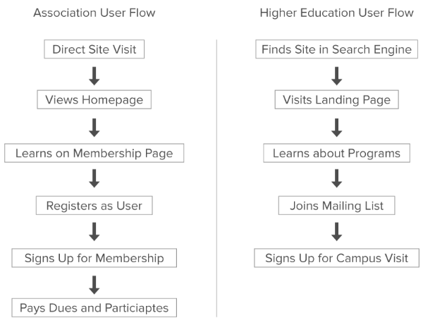
By mapping the experience of the user, you can plan a smooth process—a flow—that leads your users to their intended action while also finding convenient ways to suggest actions they hadn’t considered. Start by mapping the simplest path from user arrival to user conversion, then identify the best opportunities to present other information along the way (without yanking the user out of the flow).
Thoughts on design delivered to your inbox
Understanding Entry Points
How did users find your website? And where do they typically enter it—through the homepage, a landing page, or some other “side door”?
It makes a difference.
For example: If one of your sub-pages ranks high in Google search results, and thus, is attracting many users through this “side door,” the majority of your users may not see the curated presentation of your homepage. Instead, their first impression of you is this sub-page, which may be in the middle of your user flow—or not in the flow at all. Knowing this will allow you to create a plan to move users into the flow from the “side door” page.
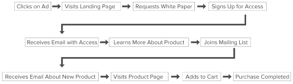
Layered Goals are Progress Checks for Long-Term Outcomes
You may have multiple goals for a user because your process isn’t finished in just one or two interactions. Let’s call these “layered goals.”
Some organizations have multiple checkpoints along the way to a single, large goal—and it can take months to reach. Mapping these steps can reveal opportunities to re-engage and provide guidance along the way.
Review the Right Analytics
Without data, you’ll have no idea whether your user flow is actually working.
When looking at your Google Analytics dashboard, It’s easy to get mesmerized by stats like “page views” or “time spent on site.” But these are often simplistic metrics.
Instead, dig a little deeper to find key performance indicators (KPIs) that connect directly to your unique goals. Some common KPIs include:
- Lead Generation Rate = percentage of users who complete a lead form
- Abandonment Rate = percentage of users who leave a lead form without completing it
- Content Downloads = number of users who download your documents after giving you their email address
- Support Requests = number of users who ask for help with your website or organization
Reviewing analytics specific to your organization will make the bottlenecks and leaks in your user flow more obvious. Then comes the fun part: architecting and designing.
Why You Should Map Out a User Flow
Mapping out a user flow will make it easier to design (or redesign) your website. It can seem like a boring step—especially when you’re eager to move on to the more tangible elements of the site. But remember: Your website is a tool. And having a sound plan before design and development begins will save you massive time and produce greater results.
Because every organization is unique, there isn’t a single ideal user flow. Yours will be one-of-a-kind, even compared to your closest competitors. It’s in these subtle differences that success will be found.
We’d love to help you crack the user flow formula that will work for you.