
Getting Website Menu Design Right
When a website is working well, it is easy to find what you are looking for without a lot of friction or work. Typically, we call sites that work like this “intuitive.” You see things where you expect them to be and you can stay focused on finding the information you need.
An intuitive website has a logical structure with a hierarchy of categories. While people often wonder what the “right amount” of categories would be for their site, more often than not, they tend to add too many. This overwhelms users with having to decipher a website’s logic rather than finding what they came to the website for in the first place.
The “Right” Amount of Menu Items
What is the right amount of menu items? This question is reminiscent of the old philosophical question: “How long should a piece of string be?” The answer of course is: “Long enough to do the job.”
If you provide your users with too many options, making a choice feels like a lot of work. On the other hand, if you offer too few options, users might miss what they are looking for.
Deciding on the “right” number of menu items is dependent on a lot of factors, including:
Audience’s Familiarity With Content
Longer lists tend to work fine for audiences who know your content. When audiences are less familiar, shorter lists are easier for them to understand.
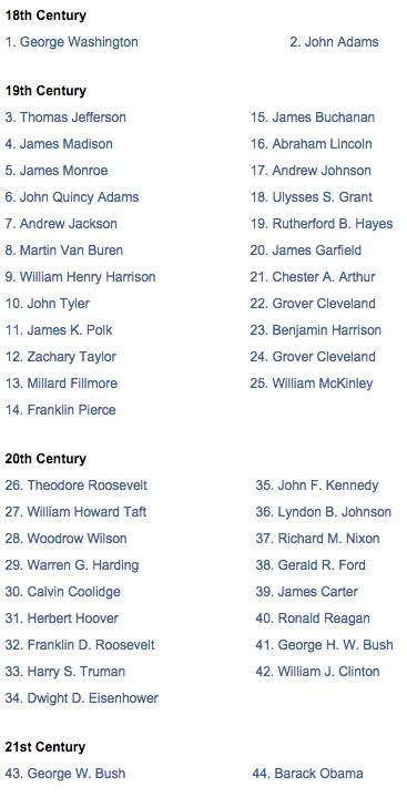
For example, a list of all U.S. presidents is pretty long, but since we are (at least roughly) familiar with the list, we can get through it easily. Rarely would a website include 44 items in a list, yet in this case we are familiar enough with the material that we can find Theodore Roosevelt or Harry Truman relatively quickly:
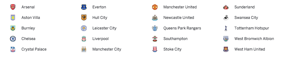
Similarly, if you are a fan of the Premier League in England, you can easily scan this list. If you are not familiar with the soccer teams or the cities, this list might confuse or overwhelm you:
Further, many companies think that customers will be able to scan through a long list of product names as quickly as their own internal teams do. The takeaway? Think about your users—and how well they know you—when organizing and presenting lists of information.
Your Business Strategy
Imagine two surgical offices. One wants to use its expansive knowledge of the subject matter to draw in customers. The other wants to be approachable and friendly to appeal to people considering surgery. Both are reasonable approaches.
However, the former might include “Maxillofacial Surgery” as one of its main headings, while the other may need to break that concept into smaller chunks such as “cleft palates,” “rebuilding of facial structures,” and “removing impacted wisdom teeth” to use terms familiar to its target audience.
Similarly, Netflix wants its customers to think that it is:
- Exhaustive, with a huge selection of movies.
- Personalized, and that it can select titles specifically for each viewer.
They can achieve both objectives through very, maybe even bizarrely, specific categories such as “Imaginative Time Travel Movies from the 1980s.”

Your Visual Design
Does your visual arrangement give the right space and shape to a long or short list of categories?
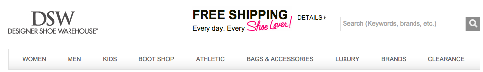
Take DSW: if they need to add another main heading, they will probably need to update their visual design. It is likely they don’t have enough space to add a new category:
Insights, delivered.
Testing Your Logic
While there is no “right” number of menu items, you can test if the ones you currently have are working today.
Here are some things you can do:
Look at your metrics
This is the best place to evaluate your menu categories. Are there navigation options that people aren’t clicking on? Maybe they are expecting certain content under a different label. Are there high-level pages that a lot of users are searching from? They may be visiting that page because the menu item creates an incorrect expectation about what they will find there. If people regularly search for a particular term from that page, it can also give you a clue about what content they are struggling to find. Search logs are a gold mine of user information.
Card sorting
How would your users organize your content? You can actually get the answer to this question by using a tool called Card Sorting. Optimal Workshop has some great tools for doing this that are easy-to-use and extremely valuable. Watch their video to learn more.
Usability testing
Sit down with representative users of your site, not other staff members, and ask them to find certain content. From the home page, ask them what they expect to be on the following page. Then have them click through and see how well it meets their expectations. Usability testing is one of the best ways to truly understand how well your website meets your audience’s needs.
Conclusion
Determining the right categories and navigation for your site can be a difficult process, but putting your users first can help you get there. Because the way people think about your content changes, you should also revisit your navigation every few years. This is often an overlooked usability issue because the way you organize content today is so familiar to your staff.
Try a few of the methods described above and let me know how it worked out for you!
