
Does Your Nonprofit Need a Responsive Website?
First, let’s be clear: The term “responsive” doesn’t simply mean “works on a smartphone.”
In fact, a responsive website works by first determining the size of the “container”—i.e., the device it’s being viewed on—and then adjusting its layout to fit. So if the size is “tablet,” the site will adjust itself to “tablet” size. If the size is “phone,” it will display your content in the phone-sized container. (And there are many phone sizes!). If some other, enormous size is detected, a responsive website will accommodate that request too.
This means that you should no longer think of the desktop view as “primary” and phones and tablets as secondary. Instead, think about your website’s content as a collection of “content chunks” that get reassembled in response to an always-changing series of containers.
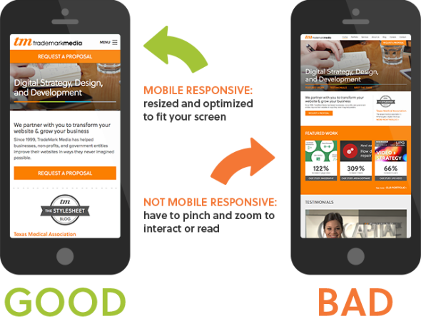
The End of Pinch-and-Zoom?
Q: Why should a responsive website be at the top of your organization’s priority list?
A: In the U.S., 98.1% of time spent online is on mobile devices—but only 42% of nonprofit websites are mobile-responsive.
This means there’s a lot of pinching and zooming on nonprofit websites today. Remember, your users are comparing your website to all other websites they visit—not just to other nonprofit websites. A bad experience is a bad experience, and instead of pinching-and-zooming, your users probably just leave—maybe never to return.
Google Rewards Responsive Websites
In April 2015, Google started Mobilegeddon—an update to its search algorithm that gives “priority to websites that display well on smartphones and other mobile devices.”
Two years later, Google still gives preference to websites that are responsive. This means your nonprofit will get an automatic search results boost by switching to a responsive layout. That boost means more traffic to your site. That additional traffic means more donors.
Do your organizational goals involve bringing in new donors? (Our guess: Yep!) If so, you need a responsive website ASAP.
Switching to a responsive website has the potential to improve your organization’s approach to managing content by forcing you to think of content as individual pieces with specific goals—as opposed to entire pages. Responsive websites demand a more nuanced approach.
Responsive Websites Improve How Content is Managed
To move from desktop to mobile requires a change in your visual priorities. Starting with a mobile layout—rather than a desktop layout—forces you to be more succinct and hierarchical in how you structure and present your content.
In other words, the process drives a new way of presenting your value, simply and directly, to your visitors.
Of course, making your content more “mobile-friendly” is often about adding structure to your pages. For example, headings—like the one entitled “Responsive Websites Improve How Content is Managed” above—are not simply larger, bolder text; they are uniquely structured chunks of meaning. Having independent units of meaning gives you the freedom to use this content in various ways, like listing the headings separate for a skimmable summary of the full article.
Switching to a responsive website without reconsidering and refining your content strategy will present problems. (On a related note, this process can also increase the emotional engagement of your site, which is essential for nonprofits.)
Nerd Alert: if you are interested in diving deeper into how mobile-responsiveness and culture intermingle, here’s a great podcast to check out.
Thoughts on responsive design delivered to your inbox
Accessibility and Responsive Design
In Web design, accessibility refers to making your site accessible to all users regardless of their disability. It includes a lot of cool design tactics and layout practices that empower people with visual or auditory impairments to still consume your website content.
Fortunately, both responsive design and accessibility move in the same direction—i.e., the more responsive your website, the more accessibile it is. There are additional steps you will need to take to achieve full accessibility, but a responsive design is a good first step.
Read more about accessibility.
If You Use Social Media, You Need a Responsive Site
Social media is consumed on mobile devices. That’s all there is to it.
When your users click on a social media link to your content, what will they see? A page built to display your content as you intend it to be consumed, or just another hard-to-see page requiring pinching? Nobody likes pinching!
As for email marketing: In 2014, 66% of email opens were on a mobile device. Do you have an email newsletter? If so, and if you don’t have a responsive site, you’re going to irritate your users and increase your unsubscribe rate.
Future-Proof Your Nonprofit
Above, we joke about the possibility of an “enormous device.” But is that really so crazy? Can you imagine a future scenario where you would need to display your website on a large screen at a conference?
Probably. And that’s the beauty of modern Web design and responsive websites: They’re ready to display effectively on the smallest and largest devices. If humans can dream it, responsive design can fit it.
Your Next Generation of Donors Demand Responsiveness
When young people—ages 18-30—first encounter your organization, what will their first impression be if you make them pinch and zoom? Will they donate anyway, going through the myriad of complicated steps to do so? Or will they simply find a better website from another organization?
The mobile takeover has come, gone, and is now the new normal. In order to connect now with the emerging generation, and set them up to become donors, good experiences on your website are crucial for creating positive brand associations.
It’s Cheaper to Go Responsive Now (Than Later)
Let’s face it: Your website is likely to become more complex over time. The longer you wait, the more difficult the change is going to be. Don’t move to responsive design under pressure or when a crisis arises. If you plan to have a website 10 years from now, responsive is in your future. Start planning now.
The Final Statistic
In the end, the results of the change to a responsive website will speak for themselves. Given the reasons above, it is actually costing you money not to have a mobile responsive website. And if nothing above has convinced you to make the move to responsive design, perhaps this statistic will:
